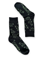
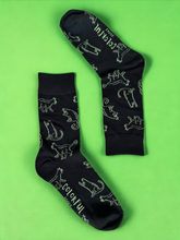
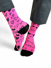
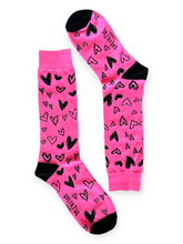
When I first started experimenting with product photography, I never realized just how much background color could influence the way people perceived an item — even something as simple as socks. Over time, I came across a wealth of research and real-world examples that proved just how powerful these subtle choices can be. That’s why these product image background color trend statistics aren’t just numbers; they’re little insights into human psychology, brand storytelling, and sales impact. From the dominance of crisp white backdrops to the rise of moody monochrome styling, every trend has a reason rooted in consumer behavior. If you’ve ever wondered why one product photo instantly feels “right” while another feels off, these statistics will shed light on the art and science behind that feeling.
Top 20 Product Image Background Color Trend Statistics 2025 (Editor's Choice)
| # | Statistic Description | Metric Value / Insight |
|---|---|---|
| 1 | Snap judgments about products influenced by color | Up to 90% |
| 2 | Customers making product decisions based purely on color | 90% |
| 3 | White backgrounds as most common in e-commerce | Dominant choice |
| 4 | Marketplaces requiring at least one white background image | Amazon, Shopify, others |
| 5 | Use of neutral tones for sophistication | Off-white, gray, beige |
| 6 | Black backgrounds for luxury products | Favored in jewelry, electronics, cosmetics |
| 7 | Solid colors based on emotional association | Blue = trust, Green = health, Yellow = joy |
| 8 | Color psychology's role in brand perception | Influences mood and consumer sentiment |
| 9 | Matching product & background color (color drenching) trend | Growing in luxury & lifestyle imagery |
| 10 | Vibrant color drenching for mood impact | Yellow/orange = energy, Red = passion, Dark shades = moodiness |
| 11 | Muted pastel palettes trend | Soft blues/greens for tranquility |
| 12 | Use of Pantone's “Very Peri” in imagery | Prominent 2022 trend |
| 13 | AI-generated images’ color statistics | Narrow hue/chroma ranges, higher object-background correlation |
| 14 | Website background color impact on pricing perception | Blue/low brightness = premium quality perception |
| 15 | Contrasting vs. similar colors influencing evaluation | Psychological effect supported by studies |
| 16 | Product images with no shadows | 91.53% in 2024 |
| 17 | White backgrounds’ dominance in e-commerce imagery | Grey tones as second preference |
| 18 | Decline in gradient background use | 0% recorded recently |
| 19 | Matching background palettes to brand identity | Enhances harmony or contrast |
| 20 | Creative backgrounds for storytelling | Wood, marble, slate, lush scenes |
Top 20 Product Image Background Color Trend Statistics 2025
Product Image Background Color Trend Statistics#1 — Snap Judgments About Products Influenced by Color
Research shows that up to 90% of snap judgments about products are influenced by color. This means that the background color in product photography plays a huge role in shaping a shopper’s first impression. When customers see a product online, the color palette can trigger immediate feelings such as trust, excitement, or skepticism. For example, a soft neutral background might convey elegance, while a bold red could spark urgency. This statistic highlights the importance of strategically selecting background colors to match brand goals.
Product Image Background Color Trend Statistics#2 — Customers Making Product Decisions Based Purely on Color
About 90% of customers make product decisions purely based on color. This doesn’t just apply to the product itself but also the environment it’s presented in, including the background. A mismatched background can make a product feel cheap or out of place, while a complementary one can elevate its appeal. In e-commerce, where touch and feel are impossible, visual cues like color become even more critical. Brands that understand this can leverage color psychology to improve conversions.
Product Image Background Color Trend Statistics#3 — White Backgrounds as Most Common in E-Commerce
White backgrounds dominate e-commerce product imagery because they provide a clean, distraction-free canvas. This neutral setting allows the product to stand out without any competing visual elements. White also aligns with most online marketplace requirements, ensuring consistency and compliance. Additionally, it adapts well to different website themes and mobile views. This popularity reflects a mix of both psychological and practical benefits for online selling.
Product Image Background Color Trend Statistics#4 — Marketplaces Requiring At Least One White Background Image
Many marketplaces, such as Amazon and Shopify, require sellers to upload at least one product photo with a pure white background. This standardization ensures a uniform shopping experience for customers. It also simplifies editing and background removal for catalog consistency. Sellers who fail to meet this requirement risk product listing rejections. Therefore, understanding and adhering to these rules is crucial for maintaining online visibility.
Product Image Background Color Trend Statistics#5 — Use of Neutral Tones for Sophistication
Neutral tones such as off-white, gray, and beige are often chosen to convey sophistication and minimalism. These shades offer a soft backdrop that doesn’t overpower the product, appealing to premium markets. They also work well with a wide variety of product colors, making them versatile for catalog shoots. Luxury brands often prefer these tones to subtly communicate quality. This trend underscores the connection between subtlety and perceived value.

Product Image Background Color Trend Statistics#6 — Black Backgrounds for Luxury Products
Black backgrounds are a common choice for luxury goods like jewelry, electronics, and cosmetics. The dark backdrop creates depth and drama, making metallic or glossy finishes pop. It also suggests exclusivity and elegance, which aligns with high-end branding. In photography, black can hide imperfections and draw the viewer’s eye directly to the product’s highlights. This style works especially well for advertising campaigns targeting affluent audiences.
Product Image Background Color Trend Statistics#7 — Solid Colors Based on Emotional Association
Solid background colors are often chosen based on their emotional associations. For instance, blue is linked to trust, green to health, and yellow to joy. These psychological triggers can subtly influence how customers perceive a product’s qualities. By aligning background color with brand messaging, sellers can reinforce their value proposition. This approach turns color selection into a strategic marketing tool rather than a mere design choice.
Product Image Background Color Trend Statistics#8 — Color Psychology’s Role in Brand Perception
Background color can significantly influence brand perception through emotional cues. A warm-toned background might make a brand feel friendly and approachable, while cooler tones could suggest professionalism. Companies often use consistent background colors to build brand recognition. Even subtle shifts in hue can change how a product is interpreted. This is why many brands invest in expert guidance when defining their photography style.
Product Image Background Color Trend Statistics#9 — Matching Product & Background Color (Color Drenching) Trend
Color drenching involves matching the product and background color for a cohesive look. This creates a monochrome effect that can feel luxurious and editorial. It works especially well in lifestyle and food photography, where mood is as important as detail. The technique is gaining popularity in social media campaigns for its striking, Instagram-friendly visuals. Brands using this approach often position themselves as bold and fashion-forward.
Product Image Background Color Trend Statistics#10 — Vibrant Color Drenching for Mood Impact
Vibrant color drenching uses bold hues like yellow and orange for energy, red for passion, and dark shades for moodiness. This approach can make product images stand out in crowded feeds. The strong color presence also sets an emotional tone before the customer even processes the product details. For instance, red backgrounds can increase urgency in limited-time offers. It’s a visually aggressive tactic, but one that can deliver high engagement.

Product Image Background Color Trend Statistics#11 — Muted Pastel Palettes Trend
Muted pastel backgrounds, such as soft blues and greens, have remained popular for their calming effect. They create a sense of tranquility and approachability, making products feel more lifestyle-oriented. Pastels also photograph well under natural lighting, preserving detail without harsh contrasts. This palette is particularly favored by wellness, skincare, and eco-conscious brands. It’s a timeless trend that balances color personality with visual comfort.
Product Image Background Color Trend Statistics#12 — Use of Pantone’s “Very Peri” in Imagery
Pantone’s 2022 color of the year, “Very Peri,” made a strong appearance in product backgrounds during its launch period. This periwinkle shade with red-violet undertones offered a modern yet playful vibe. It became a popular choice for tech and fashion brands wanting to appear innovative. While its peak has passed, it influenced subsequent background color experimentation. This shows how global color trends can filter directly into product imagery choices.
Product Image Background Color Trend Statistics#13 — AI-Generated Images’ Color Statistics
AI-generated product images tend to have narrower hue and chroma ranges compared to human-shot photos. They also display higher object-background color correlation, leading to less natural diversity. This can make them look too “perfect” and slightly artificial. While AI tools are improving, these tendencies highlight the importance of manual creative oversight. Brands must ensure AI imagery still feels authentic and aligned with audience expectations.
Product Image Background Color Trend Statistics#14 — Website Background Color Impact on Pricing Perception
The background color in product photography can affect perceived pricing. Studies show that blue or low-brightness backgrounds lead consumers to associate high prices with high quality. Conversely, bright red backgrounds can make high prices feel like a negative sacrifice. This effect can subtly influence purchasing decisions without changing the product itself. Strategic use of color here can support premium positioning or value-driven marketing.
Product Image Background Color Trend Statistics#15 — Contrasting vs. Similar Colors Influencing Evaluation
Whether a background color contrasts with or matches the product can impact customer evaluation. Contrasts tend to make products stand out sharply, which can be good for visual attention but risky for brand tone. Similar colors create harmony and a softer presentation. Both strategies have their place depending on campaign goals. Understanding when to use each is key to optimizing product photography.

Product Image Background Color Trend Statistics#16 — Product Images With No Shadows
According to recent industry reports, 91.53% of e-commerce product images feature no shadows. This creates a clean, distraction-free presentation that’s consistent across catalogs. Removing shadows also helps products blend seamlessly with white or flat-colored backgrounds. This approach supports the minimalist aesthetic popular in modern online retail. However, some brands add soft shadows for depth in premium campaigns.
Product Image Background Color Trend Statistics#17 — White Backgrounds’ Dominance in E-Commerce Imagery
Even with new trends emerging, white backgrounds continue to dominate in e-commerce photography. Their simplicity works well across product categories and marketplaces. White backgrounds also ensure colors appear true-to-life without unwanted tints. This reliability is one reason they remain a go-to choice for consistent branding. It’s a classic standard that aligns with consumer expectations.
Product Image Background Color Trend Statistics#18 — Decline in Gradient Background Use
Gradient backgrounds have seen a significant decline, with zero recorded requests in recent reports. Once popular for adding dimension, gradients are now considered distracting in many e-commerce contexts. The shift reflects a preference for uniform, minimalist backgrounds that put all focus on the product. Gradients may still appear in creative campaigns, but less so in core catalog imagery. This change mirrors the broader move toward simplicity in design.
Product Image Background Color Trend Statistics#19 — Matching Background Palettes to Brand Identity
Choosing background colors that align with brand identity creates visual harmony. For example, a sustainable brand might use earthy greens, while a tech brand might opt for sleek grays or blues. This strategy strengthens brand recognition over time. It also ensures that every product image feels like part of a cohesive collection. Inconsistent backgrounds, on the other hand, can dilute branding efforts.
Product Image Background Color Trend Statistics#20 — Creative Backgrounds for Storytelling
Creative backgrounds using materials like wood, marble, slate, or natural settings add depth and context to product images. These backgrounds can help tell a story about the product’s use or origin. For example, a coffee product shot on a rustic wooden table suggests artisanal quality. Such settings are especially effective in social media marketing. They offer visual variety while still showcasing the product effectively.

Bringing Color Into Focus
At the end of the day, choosing the right background color for a product image isn’t about blindly following a trend; it’s about understanding the mood you want to create and the story you want to tell. These insights show how something as small as a backdrop choice can have a measurable impact on customer perception, engagement, and even sales. Whether it’s white for clarity, black for luxury, or a pastel for calm, every color comes with its own set of emotions and associations. I’ve found that paying attention to these details transforms product photography from a simple shoot into a strategic brand moment. So next time you set up a photo — even if it’s just for a pair of socks — remember that the background might be doing more talking than you think.
SOURCES
-
https://pps.innovatureinc.com/color-psychology-in-product-photography/
-
https://instapage.com/blog/ultimate-guide-to-color-psychology
-
https://soona.co/blog/what-your-product-background-color-tells-your-customers
-
https://www.prodoto.com/behind-prodoto/blog/product-photography-trends-2025
-
https://cgifurniture.com/blog/top-10-product-photography-trends/
-
https://opg.optica.org/josaa/abstract.cfm?uri=josaa-42-5-B76
-
https://www.tandfonline.com/doi/abs/10.1080/15551393.2024.2382070
-
https://offshoreclipping.com/blog/product-photo-background-ideas/


