

TOP 20 POWER COLOR PERCEPTION TRENDS 2025
I’ve always found it fascinating how colors can shift the way we feel without us even noticing. The Power Color Perception Trends shaping 2025 remind me of how something as small as pulling on my favorite pair of socks can completely change my mood—it’s subtle, but powerful. Colors work the same way: they set the tone for our spaces, our clothes, and even the way we connect with brands. Some shades bring us comfort, others spark excitement, and a few even transport us into a different era. Exploring these trends feels less like analyzing design and more like discovering little emotional shortcuts built into everyday life.
Top 20 Power Color Perception Trends 2025 (Editor's Choice)
| # | Trend | Trend Description |
|---|---|---|
| 1 | Earth-inspired Neutrals | Muted browns, sage greens, and terracottas emphasize nature and authenticity. |
| 2 | Futuristic Metallics | Iridescent and metallic tones convey innovation and a tech-forward look. |
| 3 | Retro-Futuristic Palettes | Neon accents blended with vintage shades for nostalgic modern energy. |
| 4 | Gradient Revolution | Dynamic color gradients add depth and movement in digital design. |
| 5 | Bold Neons | Vibrant pinks, blues, and greens grab attention and energize visuals. |
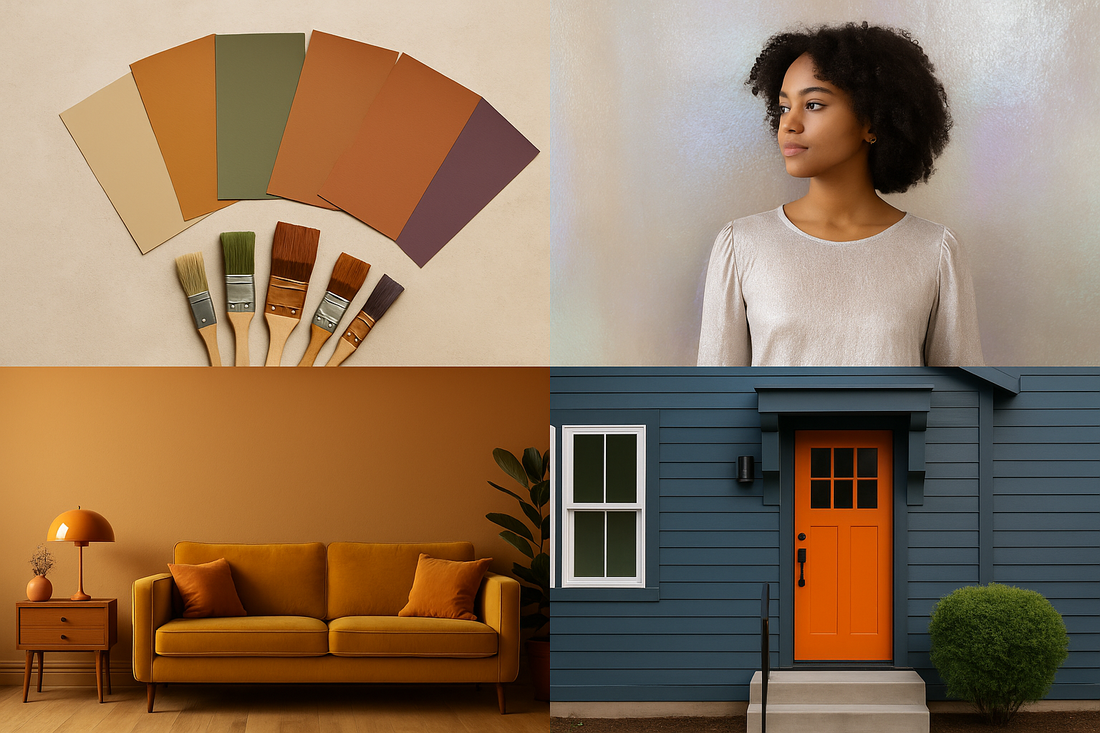
| 6 | Dusty Earth Tones | Rich terracotta, chocolate, and eggplant hues bring warmth and grounding. |
| 7 | Mocha Mousse | Pantone’s 2025 Color of the Year, a cozy brown, sets a rich tone. |
| 8 | Calming Neutrals | Modern neutral palettes that balance comfort and versatility. |
| 9 | Cosmic Metallic-Earth Blends | Mixing metallic textures with earthy tones for cosmic futurism. |
| 10 | Nostalgic Vintage Hues | Ochres, burnt oranges, and mustard yellows revive retro vibes. |
| 11 | Soft Futurism | Pastel metallics like pearl peach and silvery blue for dreamy luxury. |
| 12 | Monochromatic Magic | Single-hue palettes (e.g., deep blues) create calm minimalism with drama. |
| 13 | Quietly Colorful | Soft, organic shades emphasize comfort and subtle expression. |
| 14 | Luxury Bold Interiors | Navy, oxblood, plum, and teal provide sophistication and depth. |
| 15 | Retro Home Revival | Mustard, olive, and rust tones paired with velvet textures. |
| 16 | Grey’s Comeback | Grey resurfaces as a calming, adaptable foundation color. |
| 17 | Contrasting Trim | Bold doors and trims add architectural expression beyond white basics. |
| 18 | Cultural Orange | Bright orange symbolizes creativity, warmth, and cultural vibrance. |
| 19 | Age-Related Color Shifts | Older adults perceive saturated hues less vividly due to vision changes. |
| 20 | Physiological Effects | Light and brightness alter hue perception (e.g., Hunt effect). |
Top 20 Power Color Perception Trends 2025
Power Color Perception Trends#1: Earth-Inspired Neutrals
Earth-inspired neutrals like sage, terracotta, and soft browns are gaining traction because they feel authentic and organic. These colors connect people emotionally to nature, evoking calmness and grounding. Brands use them to highlight sustainability and mindfulness in their messaging. In fashion, such tones often suggest timelessness and versatility. Their subtlety makes them perfect backdrops that allow bolder accents to shine.
Power Color Perception Trends#2: Futuristic Metallics
Metallics and iridescent hues reflect a sleek, modern energy tied to innovation. They are heavily used in technology branding and futuristic fashion lines. These colors suggest movement, dynamism, and high performance. The reflective nature also symbolizes transparency and progress. In marketing, they capture attention instantly while reinforcing ideas of advancement.
Power Color Perception Trends#3: Retro-Futuristic Palettes
Retro-futurism combines vintage hues with neon modern accents. It evokes nostalgia while promising innovation, appealing to both young and older audiences. Designers lean on this palette to mix familiarity with surprise. It suggests optimism about the future while honoring the past. This trend works especially well in digital art and brand storytelling.

Power Color Perception Trends#4: Gradient Revolution
Gradients are dominating visual design for their ability to blend moods and emotions. They add depth and fluidity compared to flat colors. Digital platforms adopt them to convey energy and motion. Gradients also allow brands to differentiate themselves with unique blends. This perception trend reflects audiences’ preference for dynamic and layered visuals.
Power Color Perception Trends#5: Bold Neons
Bold neon colors like hot pink, electric blue, and neon green demand attention. They create a sense of energy, excitement, and nightlife vibrance. These colors are particularly popular in youth fashion and online campaigns. Neons signal confidence and modernity, making them perfect for trend-driven industries. Their high saturation ensures they stand out even in crowded digital spaces.
Power Color Perception Trends#6: Dusty Earth Tones
Dusty earth tones such as terracotta and chocolate brown suggest warmth and grounding. They represent stability and comfort in visual storytelling. These tones are often used in home interiors and slow-fashion branding. People perceive them as safe, timeless, and approachable. The muted richness also makes them sophisticated without being overpowering.
Power Color Perception Trends#7: Mocha Mousse (Pantone)
Pantone’s 2025 Color of the Year, Mocha Mousse, highlights coziness and richness. This deep brown conveys comfort and a sense of luxury. It pairs well with both neutrals and bold shades, giving versatility. Consumers perceive it as trustworthy, warm, and refined. Its global recognition further solidifies brown as a powerful design choice in 2025.
Power Color Perception Trends#8: Calming Neutrals
Calming neutrals such as soft beige, light grey, and muted creams offer a soothing effect. They are used to create clean and minimalist aesthetics. In branding, they represent reliability and understated elegance. Their versatility makes them adaptable across industries from fashion to tech. Audiences perceive these shades as stress-relieving and timeless.
Power Color Perception Trends#9: Cosmic Metallic-Earth Blends
Cosmic blends merge shimmering metallics with grounded earth tones. This creates a futuristic yet natural duality in perception. These colors suggest mystery, exploration, and balance between technology and nature. Brands use them to symbolize innovation while staying relatable. The mix appeals to audiences who value both progress and tradition.
Power Color Perception Trends#10: Nostalgic Vintage Hues
Vintage hues like ochre, avocado green, and mustard yellow take people back to the 60s and 70s. These tones trigger feelings of familiarity and cultural identity. Designers use them to tap into retro charm while staying modern. They convey warmth, playfulness, and a sense of history. Consumers often link these hues to authenticity and comfort.
Power Color Perception Trends#11: Soft Futurism
Soft futurism leans on pastel metallics such as silvery pinks and pearl blues. These hues combine elegance with a dreamy, futuristic mood. They are popular in luxury design and high-end fashion. Audiences perceive them as innovative yet approachable. Their delicate shimmer also suggests refinement without aggressiveness.
Power Color Perception Trends#12: Monochromatic Magic
Monochromatic palettes rely on varied shades of a single hue. They create minimalism while maintaining visual interest. These schemes suggest harmony, order, and sophistication. Designers use them to focus attention on textures and forms. Audiences perceive them as calm, modern, and uncluttered.

Power Color Perception Trends#13: Quietly Colorful
“Quietly colorful” palettes focus on soft tones that aren’t overwhelming. They balance vibrancy with subtlety, making them versatile. These hues are often tied to well-being and comfort-driven environments. They help people feel cheerful without being overstimulated. Brands use them to create approachable and friendly identities.
Power Color Perception Trends#14: Luxury Bold Interiors
Bold, deep shades like navy, oxblood, and dark teal convey luxury and sophistication. These colors elevate spaces with richness and drama. They signal exclusivity and high taste in perception. In fashion, they often appear in eveningwear and premium accessories. Audiences associate them with wealth, power, and elegance.
Power Color Perception Trends#15: Retro Home Revival
Retro revival focuses on earthy mid-century shades like olive, rust, and mustard. These tones combined with textures like velvet evoke nostalgia. They create a sense of heritage while being fashionable again. Consumers perceive them as playful yet elegant. This revival also taps into sustainable design trends by reusing classic palettes.
Power Color Perception Trends#16: Grey’s Comeback
Grey is re-emerging as a foundational neutral in 2025. It provides balance, calm, and understated elegance. Designers pair it with brighter colors to create contrast. Audiences perceive grey as stable and trustworthy. Its versatility ensures it remains timeless in design and fashion.

Power Color Perception Trends#17: Contrasting Trim
Using bold colors for doors and trims adds a new layer of architectural expression. It breaks away from the dominance of plain white. Designers use it to highlight structure and creativity. People perceive such contrasts as daring and stylish. This approach enhances individuality in both fashion and interior design.
Power Color Perception Trends#18: Cultural Orange
Orange is trending as a cultural and creative power color. It symbolizes warmth, enthusiasm, and energy. In media and fashion, it has become a bold statement shade. Audiences associate it with confidence and individuality. Its cultural resurgence reflects optimism and collective expression.
Power Color Perception Trends#19: Age-Related Color Shifts
Research shows aging eyes perceive saturated colors less vividly. This influences product design for older demographics. High-contrast colors are often used to maintain accessibility. The shift affects fashion and interior choices for seniors. Awareness of these changes allows inclusive color strategies.
Power Color Perception Trends#20: Physiological Effects
Physiological effects like the Hunt effect make colors appear more vivid at higher brightness. Designers use such insights to optimize lighting and color presentation. This enhances consumer perception in stores and online. It explains why colors can feel different under varying conditions. Understanding this trend helps brands create impactful visual experiences.

Why These Trends Resonate With Us
What stands out to me about the Power Color Perception Trends is how personal they really are. They’re not just about what looks good on a screen or in a store, but about the emotions we carry with us when we see them. Neons can make us feel bold, while soft neutrals remind us to slow down; earthy browns ground us, and shimmering metallics invite us to dream. Much like choosing the right outfit for the right moment, picking up on these colors helps us tell our own story without saying a word. In the end, color isn’t just about style—it’s about how we want to show up in the world, and that’s why these trends matter so much.
SOURCES
· https://www.gensler.com/blog/the-power-of-colour-to-shape-everyday-experiences
· https://medium.com/@fantabuloustef/the-power-of-colors-60e22479a87e
· https://www.beyonddesign.com/the-power-and-psychology-of-color-in-design/
· https://deksia.com/blog/the-power-of-color-color-psychology-branding-consumer-action
· https://cosmicostudios.medium.com/the-power-of-color-psychology-in-web-design-b798e956797a
· https://www.theinteriordesigninstitute.com/us/en/blog-power-of-color-psychology-in-design
· https://www.bigvoodoo.com/posts/power-of-color-psychology-in-marketing
· https://madcreativebeanstalk.com/2023/10/29/the-power-of-color-trends-in-social-media-design/
· https://www.adobe.com/express/learn/blog/color-psychology-of-branding
· https://insightsinmarketing.com/the-power-of-color-in-branding-and-marketing/
· https://vibrantz.com/vibrantz-edge/the-power-of-color-in-consumer-trends-2/
· https://www.ft.com/content/2bd9d634-3c75-4643-bbe5-d3953068f2a2
· https://www.bonappetit.com/story/how-food-colors-determines-taste-and-cravings
· https://www.logome.ai/blogs/power-of-color-branding
· https://www.adelaidenow.com.au/lifestyle/how-age-and-health-affects-colour-perception


