

TOP 20 POP-UP UX FATIGUE STATISTICS 2025
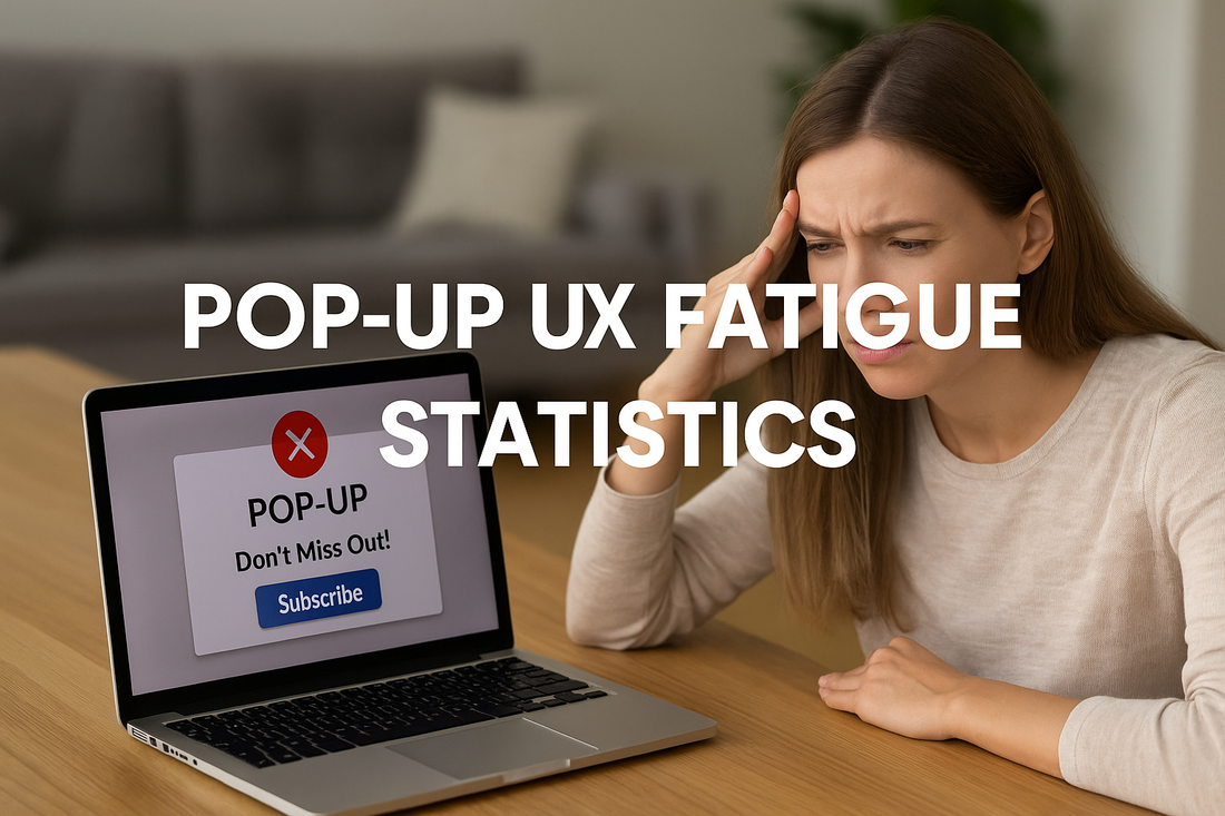
When I first started digging into pop-up UX fatigue statistics, I couldn’t help but think about how it feels when you put on socks that are too tight—they might serve a purpose, but after a while, the constant squeeze becomes unbearable. That’s exactly how users experience endless pop-ups and alerts online: what’s meant to inform or guide instead creates friction, irritation, and fatigue. From cookie consent banners that pop up every time you browse to clinical alerts overwhelming doctors, the numbers tell a story of people being bombarded until they tune everything out. It’s not just about digital noise; it’s about how constant interruptions chip away at trust, patience, and attention. These statistics shine a light on why thoughtful, respectful design matters more than ever in creating user experiences that truly serve people.
Top 20 Pop-up UX Fatigue Statistics 2025 (Editor’s Choice)
| # | Statistics | Category / Context | Impact / Interpretation |
|---|---|---|---|
| 1 | ~1,020 cookie banners per year | Cookie / Consent Fatigue | Users face overwhelming repetitive prompts, contributing to frustration. |
| 2 | 1.4 hours per user annually wasted on cookie banners | Cookie / Consent Fatigue | Time drain undermines browsing efficiency and creates annoyance. |
| 3 | Repetitive privacy prompts lower satisfaction | Cookie / Consent Fatigue | Decision avoidance increases as users disengage from meaningful choices. |
| 4 | 70% unsubscribed due to message overload | Messaging Fatigue | Direct business loss from excessive pop-ups and messaging. |
| 5 | ~25 pop-ups per week experienced by users | General UX Fatigue | Constant interruptions damage browsing flow and user patience. |
| 6 | 95.1% of drug-drug alerts overridden | Healthcare Alert Fatigue | Critical safety warnings ignored due to overexposure. |
| 7 | 49–96% of clinical alerts overridden | Healthcare Alert Fatigue | High override rates reduce trust in healthcare alert systems. |
| 8 | Median 12 alerts/month, most closed in <3 sec | Healthcare Alert Fatigue | Clinicians dismiss alerts without review, risking errors. |
| 9 | ~2M physiologic alerts per month in ICU | Healthcare Alert Fatigue | Overwhelming alert volume distracts from patient care. |
| 10 | Providers get ~69 alerts/day; 87% say excessive | Healthcare Alert Fatigue | Too many alerts lead to missed critical information. |
| 11 | ~165 alerts/day per patient (adjusted) | Healthcare Alert Fatigue | Massive overload creates dangerous risk of alert blindness. |
| 12 | 72–99% clinical alarms are false | Healthcare Alert Fatigue | False alarms destroy trust and encourage dismissals. |
| 13 | 52% of security alerts false; 64% redundant | Security Alert Fatigue | IT teams waste resources on irrelevant or duplicated alerts. |
| 14 | 19 of 20 hospitals cite alert fatigue as top concern | Healthcare Alert Fatigue | Systemic recognition that alert fatigue is a major safety issue. |
| 15 | Only 0.1% prescribing alerts accepted | Healthcare Alert Fatigue | Extreme skepticism of pop-up alerts undermines usefulness. |
| 16 | ~40% of overrides clinically inappropriate | Healthcare Alert Fatigue | Important alerts are ignored, raising patient safety risks. |
| 17 | UX clutter reduces conversions | Design Fatigue (E-commerce) | Too many elements (pop-ups, chat boxes) lower user willingness to buy. |
| 18 | Fatigue reduces social media engagement | Design Fatigue (Social Media) | Users scroll faster and convert less when overloaded with pop-ups. |
| 19 | Early pop-ups dismissed instantly | General UX Fatigue | Premature interruptions prevent content engagement. |
| 20 | Mobile apps use “sneaky patterns”; 88% dismissed by AI | Mobile UX Fatigue | Manipulative designs erode trust; automation tools skip them. |
Top 20 Pop-up UX Fatigue Statistics 2025
Pop-up UX Fatigue Statistics #1: ~1,020 Cookie Banners Per Year
Users encounter an overwhelming number of cookie consent banners annually, averaging more than 1,000 prompts. This constant exposure creates fatigue and leads people to dismiss banners without carefully considering their choices. The repetition reduces attention and undermines meaningful consent. As a result, many users feel irritated by websites rather than engaged. This shows how poorly designed compliance prompts can erode trust and usability.
Pop-up UX Fatigue Statistics #2: 1.4 Hours Per User Annually Wasted On Cookie Banners
Studies show that European users collectively spend around 575 million hours per year interacting with cookie pop-ups. On an individual level, this equals about 1.4 wasted hours per person annually. This seemingly small number becomes significant when scaled across millions of users. It highlights how inefficient design drains time and damages user satisfaction. Reducing banner frequency could save both time and attention.

Pop-up UX Fatigue Statistics #3: Repetitive Privacy Prompts Lower Satisfaction
When users are repeatedly asked to respond to the same privacy prompts, engagement drops. Research confirms that decision avoidance increases, meaning people often click quickly without thinking. This creates poor quality consent and damages brand reputation. Over time, users associate websites with frustration rather than trust. Consistency and smarter design could restore some balance.
Pop-up UX Fatigue Statistics #4: 70% Unsubscribed Due To Message Overload
A large share of users, around 70%, have unsubscribed from at least one brand due to excessive messaging. This illustrates how aggressive communication strategies backfire. Instead of creating engagement, they push customers away. People want control over frequency, not constant interruptions. Brands ignoring this risk losing loyalty and revenue.
Pop-up UX Fatigue Statistics #5: ~25 Pop-ups Per Week Experienced By Users
UX researchers have recorded that users encounter about 25 pop-ups every week. This frequency is unsustainable and contributes to mental exhaustion. Each pop-up interrupts focus and creates frustration. The cumulative effect is a strong negative association with digital experiences. Reducing pop-ups could meaningfully improve browsing flow.
Pop-up UX Fatigue Statistics #6: 95.1% Of Drug-drug Alerts Overridden
In clinical settings, nearly all drug interaction alerts are overridden. This extremely high dismissal rate shows that constant alerts are losing their intended value. Doctors ignore them because most are irrelevant, leading to dangerous risks. Critical warnings blend in with unnecessary noise. This proves alert fatigue has direct safety consequences.
Pop-up UX Fatigue Statistics #7: 49–96% Of Clinical Alerts Overridden
Across multiple studies, override rates for clinical alerts range between 49% and 96%. This wide range still shows a consistent trend of high dismissal. The overload of alerts leads to a culture of ignoring prompts. Healthcare professionals are desensitized to potentially important signals. Reducing unnecessary alerts could improve attention to critical ones.

Pop-up UX Fatigue Statistics #8: Median 12 Alerts Per Month, Most Closed In Under 3 Seconds
Healthcare providers receive about 12 alerts monthly, most dismissed in less than three seconds. This rapid closure suggests alerts are not carefully reviewed. Instead of supporting decision-making, they become distractions. Clinicians act instinctively to remove interruptions rather than evaluate them. This diminishes the usefulness of digital support systems.
Pop-up UX Fatigue Statistics #9: ~2 Million Physiologic Alerts Per Month In ICU
Intensive care units generate nearly 2 million monitor alerts each month. This flood of notifications is far beyond what clinicians can process. Many alerts are redundant or false, overwhelming staff. As a result, important signals may be missed among the noise. Patient safety suffers because of poorly managed alert systems.
Pop-up UX Fatigue Statistics #10: Providers Get ~69 Alerts Per Day; 87% Say Excessive
On average, providers are hit with about 69 alerts daily in ICU environments. Almost nine in ten clinicians report this volume as excessive. The perception of overload leads to frustration and fatigue. More importantly, it reduces attention to truly urgent information. This constant noise erodes the effectiveness of digital health systems.
Pop-up UX Fatigue Statistics #11: ~165 Alerts Per Day Per Patient (Adjusted)
When adjusted for duplicate views, clinicians face about 165 alerts per patient daily. This number is staggering and far exceeds human attention capacity. It creates an environment where dismissal becomes the default. With up to 7,000 alerts per day per provider, the system borders on unmanageable. This proves alert fatigue is not only common but inevitable under current designs.
Pop-up UX Fatigue Statistics #12: 72–99% Clinical Alarms Are False
Studies show that most clinical alarms, between 72% and 99%, are false. These false positives create distrust among clinicians. Over time, staff begin ignoring alarms regardless of their validity. This behavior significantly increases patient risk. Eliminating false alerts is essential to restore confidence.
Pop-up UX Fatigue Statistics #13: 52% Of Security Alerts False; 64% Redundant
In cybersecurity, over half of alerts are false and nearly two-thirds are redundant. IT teams waste energy addressing irrelevant prompts. This slows responses to actual threats. Security analysts often face exhaustion from repetitive noise. Alert fatigue here creates vulnerabilities for organizations.
Pop-up UX Fatigue Statistics #14: 19 Of 20 Hospitals Cite Alert Fatigue As Top Concern
A survey revealed that 95% of hospitals rank alert fatigue as their number-one safety concern. This is a near-universal recognition of the problem. It shows institutions acknowledge systemic flaws in their alert systems. Despite awareness, solving the issue has proven difficult. The scale of the challenge continues to endanger patient safety.

Pop-up UX Fatigue Statistics #15: Only 0.1% Prescribing Alerts Accepted
Electronic prescribing systems see acceptance rates as low as 0.1%. This means one in a thousand alerts is acted upon. Such a low rate reflects deep mistrust of alerts. Clinicians no longer differentiate between useful and useless messages. The system undermines itself through overload.
Pop-up UX Fatigue Statistics #16: ~40% Of Overrides Clinically Inappropriate
Research indicates that about 40% of overridden alerts were clinically inappropriate. This means critical guidance was dismissed wrongly. The consequences can be dangerous for patients. Fatigue leads to careless decision-making in high-stakes contexts. Reducing nonessential alerts would help safeguard medical decisions.
Pop-up UX Fatigue Statistics #17: UX Clutter Reduces Conversions
E-commerce sites with too many pop-ups and overlays see reduced conversions. Users feel annoyed when constantly interrupted while shopping. Design clutter disrupts the path to purchase. Simpler layouts encourage better engagement and higher sales. Balance is key to avoid driving away potential buyers.
Pop-up UX Fatigue Statistics #18: Fatigue Reduces Social Media Engagement
On social platforms, users overwhelmed by pop-ups and ads engage less. They scroll faster, skip content, and ignore promotions. Even high-quality posts are affected by this fatigue. Brands lose opportunities to connect meaningfully. This shows that overuse of attention-grabbing tactics backfires.
Pop-up UX Fatigue Statistics #19: Early Pop-ups Dismissed Instantly
Pop-ups displayed before users view content are usually closed immediately. The interruption feels intrusive and disrespectful to their time. This damages trust and discourages further browsing. People expect to access content before being asked for actions. Poor timing makes pop-ups counterproductive.

Pop-up UX Fatigue Statistics #20: Mobile Apps Use Sneaky Patterns; 88% Dismissed By AI
A 2025 study found mobile apps often use manipulative pop-ups to force actions. These deceptive patterns include misleading buttons and forced consent. However, AI tools can dismiss nearly 88% of them automatically. This shows how users and technology fight back against dark design. The presence of sneaky pop-ups erodes trust in apps and brands.
Why These Stats Matter For Everyday Design
Looking at all these numbers, it’s clear that pop-up fatigue is more than a UX nuisance—it’s a universal problem that touches everything from shopping to healthcare. Like wearing socks with a hole in them, people eventually notice the discomfort and decide they’ve had enough. The key takeaway here is that every unnecessary interruption comes at a cost: reduced trust, lost conversions, or even patient safety. By listening to what these pop-up UX fatigue statistics reveal, designers and brands have the chance to rethink how they capture attention. Less clutter, better timing, and genuine respect for users’ focus can turn digital experiences from frustrating to meaningful.
Sources


