

TOP 20 UNEXPECTED COLOR PAIRING TRENDS 2025
When I first started exploring unexpected color pairing trends, I never thought I’d find so much inspiration in combinations that once felt a little “too out there.” From fashion runways to interior design, these bold mixes are proving that creativity has no limits—and sometimes the most unusual pairings end up feeling the most stylish. I even find myself looking at everyday things differently, like how a pair of vibrant socks can completely transform a neutral outfit. It’s amazing how colors can shape mood, personality, and expression in ways we don’t expect. That’s what makes this collection of pairings so exciting—it’s about breaking rules and finding harmony in contrast.
Top 20 Unexpected Color Pairing Trends 2025(Editor's Choice)
| # | Color Pairing | Contrast Level | Trend Momentum |
|---|---|---|---|
| 1 | Plum + Forest Green | Medium | Peaking |
| 2 | Terracotta + Camel | Low | Emerging |
| 3 | Red + Sky Blue | High | Peaking |
| 4 | Yellow + Lavender | Medium | Emerging |
| 5 | Burgundy + Navy | Low | Timeless |
| 6 | Ripe Tomato Red + Deep Purple | High | Emerging |
| 7 | Butter Yellow + Bright Red | High | Peaking |
| 8 | Pink + Orange | High | Timeless |
| 9 | Blue + Brown | Medium | Timeless |
| 10 | Olive Green + Lavender | Medium | Emerging |
| 11 | Chocolate Brown + Bright Yellow | High | Peaking |
| 12 | Purple + Oxblood | Low | Emerging |
| 13 | Green + Brown | Low | Timeless |
| 14 | Pink + Brown | Medium | Peaking |
| 15 | Navy + Lilac | Medium | Emerging |
| 16 | Poppy Red + Teal Blue | High | Peaking |
| 17 | Chocolate + Peanut Butter | Low | Timeless |
| 18 | Aqua + Orange | High | Emerging |
| 19 | Unexpected Red Accents | High | Peaking |
| 20 | Aperol Orange + Cobalt Blue/Bubblegum Pink | High | Emerging |
Top 20 Unexpected Color Pairing Trends 2025
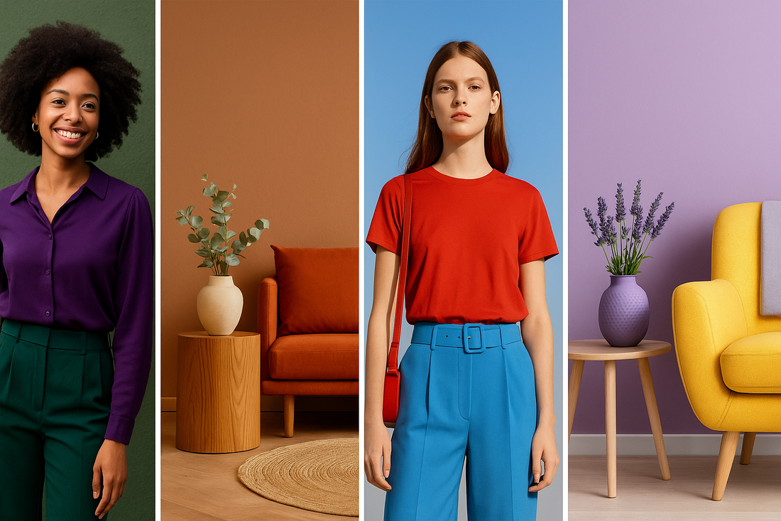
Unexpected color pairing trends#1 Plum + Forest Green
Plum and forest green combine to create a luxurious, moody aesthetic that feels timeless yet fresh. This pairing has gained popularity for both interiors and evening fashion due to its richness. Designers often use it in velvet, satin, and deep-toned accents for maximum impact. The medium contrast between the colors allows them to complement rather than overpower one another. Its momentum is peaking as more brands lean into earthy luxury palettes for 2025.
Unexpected color pairing trends#2 Terracotta + Camel
Terracotta paired with camel creates a soft, grounded aesthetic inspired by desert landscapes. This low-contrast combination provides warmth and comfort without overwhelming the eye. It works beautifully in modern minimal interiors and neutral-toned fashion. The pairing is emerging strongly as designers shift toward earthy, nature-driven palettes. It’s especially popular in transitional seasons like spring and autumn.
Unexpected color pairing trends#3 Red + Sky Blue
Red and sky blue create a high-contrast look that feels bold and playful. This pairing is often used in streetwear and casual fashion for a youthful, high-energy effect. It also makes striking graphic design and branding choices. The vibrancy of red paired with the calm of blue creates a dynamic tension. Trend momentum is currently peaking as bold contrasts dominate summer collections.
Unexpected color pairing trends#4 Yellow + Lavender
Yellow and lavender bring together a sunny tone with a soft pastel, making the combo whimsical yet modern. The medium contrast ensures that the colors balance each other instead of clashing. Designers love this pairing for spring and summer wardrobes. It also appears frequently in floral-inspired interiors. The trend is emerging as people seek cheerful yet calming palettes.

Unexpected color pairing trends#5 Burgundy + Navy
Burgundy and navy are a timeless pairing that speaks to sophistication and refinement. With low contrast, the colors blend seamlessly, making them ideal for formalwear. Interiors often use this palette for libraries, offices, or elegant dining spaces. It carries a sense of maturity and grounded style. This is considered a timeless trend that resurfaces regularly in fashion cycles.
Unexpected color pairing trends#6 Ripe Tomato Red + Deep Purple
Ripe tomato red with deep purple makes a daring, high-contrast statement. It’s a bold combination used heavily in high-fashion runways to demand attention. The colors create an intense visual story perfect for editorial fashion. While daring, the pairing requires careful styling to avoid overwhelming the look. Its momentum is emerging as more designers embrace fearless palettes.
Unexpected color pairing trends#7 Butter Yellow + Bright Red
Butter yellow and bright red create a vibrant retro feel that feels joyful and youthful. The high contrast between the two ensures visibility and energy. This pairing often appears in vintage-inspired outfits and branding. It conveys warmth while retaining a sense of bold confidence. The trend is peaking as nostalgic color schemes gain traction again.
Unexpected color pairing trends#8 Pink + Orange
Pink and orange form a high-energy duo that radiates vibrancy and playfulness. The combination has been popular in both Y2K fashion and retro-modern interiors. Designers love how it pops on accessories and statement pieces. While both are warm colors, their intensity creates enough contrast to excite the eye. This is considered a timeless trend because it always resurfaces in cycles.
Unexpected color pairing trends#9 Blue + Brown
Blue and brown are a medium-contrast pairing that balances cool and warm tones. It often evokes beachy, coastal vibes and earthy balance. The pairing works well in casual fashion, interiors, and branding. Designers appreciate its versatility and grounded appeal. This combination is timeless, with consistent use across different industries.
Unexpected color pairing trends#10 Olive Green + Lavender
Olive green and lavender create a medium-contrast pairing that blends earthy with floral. It has a sophisticated elegance that feels unexpected yet refreshing. This pairing works beautifully in both interiors and fashion for spring. Designers often use it in muted palettes with pops of metallics. It’s an emerging trend as softer, surprising pairings gain attention.

Unexpected color pairing trends#11 Chocolate Brown + Bright Yellow
Chocolate brown with bright yellow forms a playful yet grounded combination. The high contrast offers visual excitement without losing stability. Interiors often use this mix to create cozy but cheerful spaces. Fashion designers incorporate it in outerwear and accessories for bold statements. The momentum is peaking with strong adoption in seasonal collections.
Unexpected color pairing trends#12 Purple + Oxblood
Purple and oxblood combine into a dark, low-contrast palette with rich depth. This duo creates a moody, dramatic feel perfect for eveningwear. Interiors often feature it in luxurious textiles like velvet and suede. Its sophistication lies in its subtle intensity rather than brightness. The trend is emerging as designers embrace darker palettes with modern flair.
Unexpected color pairing trends#13 Green + Brown
Green and brown are a low-contrast pairing that reflects natural harmony. This timeless duo is rooted in earth tones and sustainability aesthetics. Designers use it heavily in eco-conscious branding and interiors. Fashion often sees this pairing in casual and outdoor wear. The combination remains timeless due to its universal connection with nature.
Unexpected color pairing trends#14 Pink + Brown
Pink and brown together create a medium-contrast palette that is soft yet grounded. The warmth of brown tones down pink’s sweetness for a chic effect. Interiors use this combo for cozy and stylish living spaces. Fashion adopts it in accessories and outerwear for an elegant but approachable look. The trend is peaking due to its versatile, wearable balance.

Unexpected color pairing trends#15 Navy + Lilac
Navy and lilac combine sophistication with playful softness. This medium-contrast pairing works beautifully in both formal and casual styles. Designers appreciate its ability to bring elegance while remaining modern. Interiors use it for calming yet stylish bedrooms and living areas. The trend is emerging, gaining popularity in pastel-meets-classic palettes.
Unexpected color pairing trends#16 Poppy Red + Teal Blue
Poppy red with teal blue forms a high-contrast duo bursting with energy. The pairing stands out strongly in fashion editorials and bold design projects. It’s an eye-catching look for branding and marketing campaigns. The colors balance fiery passion with cool vibrancy. The trend is peaking as designers crave bold, unapologetic palettes.
Unexpected color pairing trends#17 Chocolate + Peanut Butter
Chocolate paired with peanut butter shades creates a cozy, monochromatic feel. The low contrast keeps the palette warm and harmonious. Interiors often use this combination for kitchens and living spaces to evoke comfort. Fashion uses it in autumn collections with textured fabrics. This is considered a timeless palette due to its familiar, comforting nature.
Unexpected color pairing trends#18 Aqua + Orange
Aqua and orange combine for a high-contrast, coastal-inspired vibe. This pairing feels playful, youthful, and energetic. Designers often use it in resort wear and beach interiors. The balance of cool aqua with warm orange creates lively visual interest. It’s an emerging trend gaining momentum in summer collections.
Unexpected color pairing trends#19 Unexpected Red Accents
The “unexpected red” theory pairs bold red accents with neutral or muted palettes. This high-contrast strategy transforms otherwise simple outfits or spaces. Designers often apply it in accessories, shoes, or small furniture pieces. Its success lies in red’s ability to capture instant attention. The trend is peaking as social media popularizes it globally.

Unexpected color pairing trends#20 Aperol Orange + Cobalt Blue/Bubblegum Pink
Aperol orange with cobalt blue or bubblegum pink creates a lively, high-contrast look. It is playful and expressive, often seen in summer fashion. Designers love it for adding vibrancy to collections and branding. The pairing feels festive, fresh, and youthful. It’s emerging rapidly, especially in warm-weather wardrobes.
A Personal Takeaway on Color
As I reflect on these unexpected color pairing trends, I realize how much they’ve challenged me to see design and fashion in a more playful way. I used to stick with “safe” palettes, but now I find myself experimenting with colors I never would have considered before. There’s a joy in letting go of perfection and just embracing combinations that spark energy. I believe these pairings show us that style is as much about personality as it is about aesthetics. For me, the biggest takeaway is simple: sometimes the best looks come from taking risks.
SOURCES
-
https://www.whowhatwear.com/fashion/summer/color-blocking-summer-outfit-ideas
-
https://www.decorilla.com/online-decorating/interior-design-trends-2025/
-
https://www.homesandgardens.com/interior-design/lulu-and-georgia-fall-collection-2025
-
https://www.pinterest.com/ideas/plum-and-forest-green/930045274011/
-
https://www.marieclaire.com/fashion/summer-2025-color-combinations/


